There are two secrets to creating great landing pages:
- Stripping away the irrelevant flourishes and focusing on the fundamentals, and
- Monitoring the success of your landing pages
For number one, you need to know basic design fundamentals. Among these are:
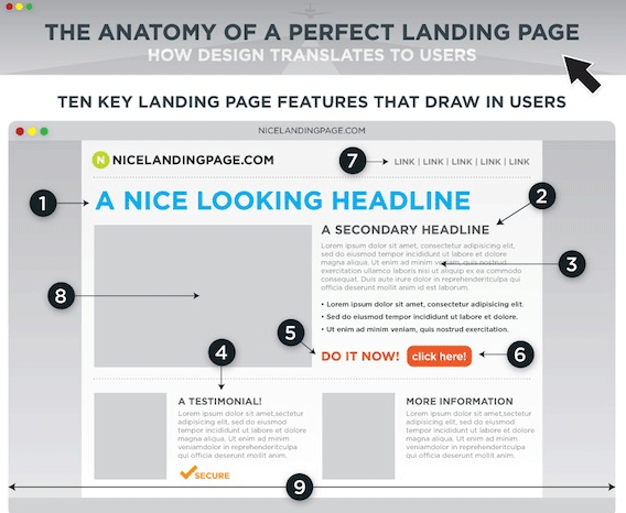
Good Design
The basics of web design have changed very little in the past decade. Good landing page design means that it is as easy as possible to navigate to other parts of your website, the landing page is clean and uncluttered, and all links lead a potential customer closer to making a purchase or submitting their contact information. It sounds simple, but building a well-designed website from can take years of experience. If you’re relatively new at web design, consider using automatic generators for your landing pages.
All Necessary Content Above the Fold
“Above the fold” means content that is visible without scrolling, navigating, or clicking buttons. It is the content that visitors can view without expending any effort. Ideally, you should have just enough content above the fold for visitors to know that they came to the right place. The important points to hit are: what your company is about, what services you provide, and where you provide them. Any more than that can clutter the page.
Strong Calls to Action
There should be blatant calls to action in every frame and on every tab. People don’t go to websites to hear subtle pitches, they go to buy things. The buttons to buy, sign up, or request a quote should pop right out and should ideally be the first or second thing most visitors will look at. You can use a web page “heatmap” tool to figure out the exact path that most people will take.
Before and After Photos/Sales photos
Before and After photos communicate complicated narratives and ideas in a split second. Because people’s brains automatically construct stories and processes to understand chronological pictures, They are particularly effective on the websites of cosmetic surgeons, skin care specialists, and dentists, but also work great for renovation or landscaping firms. If your website’s products don’t lend themselves to before and after photos, try to work some other narrative order into your artwork. For example, you could show a sales graph increasing, a couple celebrating a new home, etc.
If you master these fundamentals, your landing page will already be better than the average in almost any industry. However, to be truly exceptional, you need to fine-tune your landing pages by tracking their success. That’s the second secret to successful landing pages.
Most web developers are unable to do this effectively, because there are many different ways that landing pages can be successful. They can lead visitors to navigate your website, but they can also lead visitors to call or email.
AdLuge stores the data from your email and phone call leads, allowing you to analyze your performance and follow up with opportunities. This gives you a total understanding of the value of each of your landing pages’ performance. Over time, you’ll be able to identify your top performing landing pages to generate the maximum number of leads.

Very useful article, Tyler.
You capture many of the important points of a landing page, I really like the picture, it helps ‘dumb’ it down, in a manner of speaking.
Another important thing I would like to add from personal experience is to make sure that you have contact information and the likes ‘above the fold’, since that is always what I look for when determining whether or not to do business with them.
If they hide away their contact information, I find that I have a tendecy to believe that they are not proud of what they are selling.
very excellent article. i learned alot. very informative.
I like how the picture illustrates everything. When most marketers talk about or explain landing pages they don’t really go into specifics on what should be on it. Just that it only needs a good sales pitch and that’s it.
I agree on focusing on the fundamentals. I have encountered a lot of websites with landing pages filled with videos, graphics and other animations that can be annoying. Thus, I ended up just exiting the page because I am too annoyed.
The “Above the fold” never occurred to me before. It’s very useful to have an important piece of information where people would focus on it first, instead of placing it last or in the “middle”. Thank you very much for information Tyler.
The tip on “Good design” is something that is very important. “Junky” looking sites or ones that look like they were designed in 1998 are an automatic “No.” for me. Great article and thanks for sharing.
My site doesn’t sell anything so I am having a hard time figuring out what I should use my “call to action” button for. I’ve settled for using it to promote our Facebook page, though I’m not sure that’s been that successful. It’s unfortunate for now, I might have to develop a product (I’m thinking ebook) to take advantage of that part of my template. Good article, thanks!
Thank you for taking something that was a little difficult for me to understand and making it much easier to comprehend. I also completely agree with the before and after photo sales section, people want something to measure improvement by, we are very visual creatures!